Why the Silent-Film Intertitle Had a Job to Do
See how the silent-film intertitle carried dialogue, clarified action, and controlled the pause between images without taking the scene away from the screen.
The most common mistake in watching a silent film is treating each intertitle as a break from the movie; that costs you the timing and emphasis the filmmakers built around it. The silent-film intertitle could supply spoken words or essential story information, but it also set a pace: a card appeared, the audience read, and the moving image resumed with new force or a changed understanding.
Cards with different jobs
An intertitle is a shot of printed text inserted into a film. It may represent dialogue, identify a place or time, explain an event the images cannot show clearly, or offer a narrator’s comment. Those jobs overlap, but they are not interchangeable. A line of dialogue belongs to a character; a plot card usually speaks in a more neutral voice.
When watching, first ask who seems to be speaking. A character’s name above a line, or a card placed between two shots of that character, often makes the words part of the scene. A card that explains a change in circumstances may instead address the audience directly. That distinction matters: character speech can reveal temperament, while explanatory text often shifts attention to what has happened.
Some films use a title card to establish where or when a scene takes place, then let gesture and setting carry the rest. Others insert a card to bridge a gap in the action, such as a journey or an unseen event. Notice whether the next shot confirms the card, complicates it, or leaves details for you to infer. The text is not always a complete account; it can be a cue for reading the images that follow.
Dialogue in printed form
A dialogue intertitle gives a silent-film character words without making the scene a narrated story. The card may preserve a short exchange, a declaration, a joke, or a piece of information the plot needs. Its placement also assigns the line: a card between close views of two people can function like a spoken reply, even though the film never records their voices.
Watch the gestures immediately before and after a dialogue card. A character may point, hesitate, turn away, or look toward another person; the words then sharpen the meaning of that movement. The same gesture can read as invitation, accusation, or refusal depending on the text around it. Rather than reading the card in isolation, let the performance frame the line.
Intertitles can also compress conversation. A film need not print every imagined sentence exchanged by its characters. It can show a brief selection of lines that clarifies the conflict while leaving the rest to expression and action. When a conversation seems to jump, consider whether the omitted speech is simply unnecessary to the scene’s visible stakes.
Typography can contribute to the effect, too. Lettering, borders, ornament, and the arrangement of words can make a card feel formal, urgent, comic, or intimate. These design choices do not replace the words, but they shape the first impression before you finish reading. A plain line of text and a highly decorated card do not ask for quite the same attention.
Information between images
Expository cards handle facts the film wants the audience to know: a character’s identity, a change in circumstances, a passage of time, or the reason a person has arrived. The useful question is not merely, “What does this card tell me?” Ask instead, “What would be unclear in the next image without it?” That points to the card’s specific task.
Text can spare a film from showing an event that is repetitive, difficult to stage, or less interesting than its consequence. A card might indicate that time has passed, while a changed costume or setting makes that passage visible. The words provide a hinge; the image supplies evidence. If the next shot already communicates the information plainly, the card may be adding emphasis rather than basic explanation.
Keep an eye on what the card withholds. “A visitor was expected” gives a different promise from a card naming the visitor or explaining why the meeting matters. Broad wording can make a later image more surprising, while precise wording can orient the audience before the action begins. The amount of information is a choice about anticipation, not just a measure of clarity.
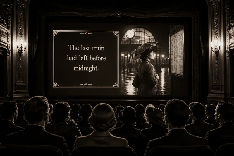
Say you are watching an invented scene in which a woman enters a train station carrying a wet umbrella. A card reads, “The last train had left before midnight,” and the next image shows her studying a closed timetable. The text establishes a time constraint; the timetable makes it concrete, and her expression suggests a problem without spelling out her next move. The card has done its job by directing attention, not by explaining every consequence.
The pause as screen time
An intertitle interrupts the image, but it does not necessarily interrupt the scene. The audience keeps following the action in memory while reading, then returns to a new shot with the text still in mind. Think of the card as a page turned between two panels of a comic: the gap can connect the images as strongly as a visible movement would.
Reading time affects rhythm. A very brief card can make information feel abrupt; a longer passage asks the audience to pause before the film resumes. The director and editor can place that pause before a reaction, after a reveal, or between gestures. Watch the first image after the card: a sudden cut to a face may make the text feel newly personal, while a wider view may let the scene breathe.
Intertitles also influence how quickly a viewer can read a scene. A dense card may slow the sequence even if the surrounding images move rapidly. A short phrase may be absorbed almost at once, allowing the next gesture to carry the emotional weight. When the rhythm feels unusual, count the alternation in practical terms: image, card, image, and the time each asks you to spend.
For viewers encountering a film with translated or restored titles, the reading experience may differ from what the original audience saw. A translation can require more or fewer words, and the design of a later edition may not match the original presentation. Treat those differences as part of the viewing context, especially when a card seems unusually crowded or its timing feels out of step with the scene.
What should you watch for?
How can you tell dialogue from narration?
Look for a character’s name, the card’s position among reaction shots, and whether the words sound like something a person in the scene would say. A general statement about time or circumstance is more likely to address the audience, though a film can blur the boundary deliberately.
Why does a film repeat information in text and image?
Repetition can make a fact unmistakable, but it can also add emphasis or create contrast. If a card says that a character is welcome while the image shows a guarded reception, the mismatch becomes part of the scene’s meaning.
What if a title card is hard to read?
Pause on the card if your viewing format allows it, and check whether the image contains a clue that makes the wording clearer. For a damaged or poorly reproduced print, do not assume a difficult phrase reflects the original film’s intended wording or design.
Should you read every card before looking at the image?
Read enough to understand the line, then return your attention to the performers and setting. The card supplies language, but the adjacent images show how characters receive it and what it changes in the scene.
A useful viewing habit
For a focused rewatch, choose a short sequence and note each card’s apparent job in the margin: dialogue, orientation, time shift, explanation, or commentary. Then mark one visible detail in the following image that supports or changes your reading. This small exercise keeps attention on the exchange between text and screen instead of turning the film into a stack of captions.
Do not assume that the most important card is the longest or most dramatic. A brief location cue can make a later action legible; a single line can change the meaning of a look. Ask what the film gains by placing the words at that exact point, and what the next image can do because you have read them.
The silent-film intertitle is easiest to appreciate when you treat it as part of the film’s editing, not as a substitute for sound or an obstacle to the images. Its words guide attention, its timing creates a pause, and its position helps the next shot land. On your next viewing, stay with the transition: the card’s job often becomes clearest in the image that follows.